Note: The images shown are static screenshots of fully interactive Power BI dashboards. If you’d like a live walkthrough or demo of the dashboards in action—complete with filters, drilldowns, and real-time interactivity—I’d be happy to share. Just reach out via Contact Me!
📊 Stinky Pinky – Residential Operations Dashboard
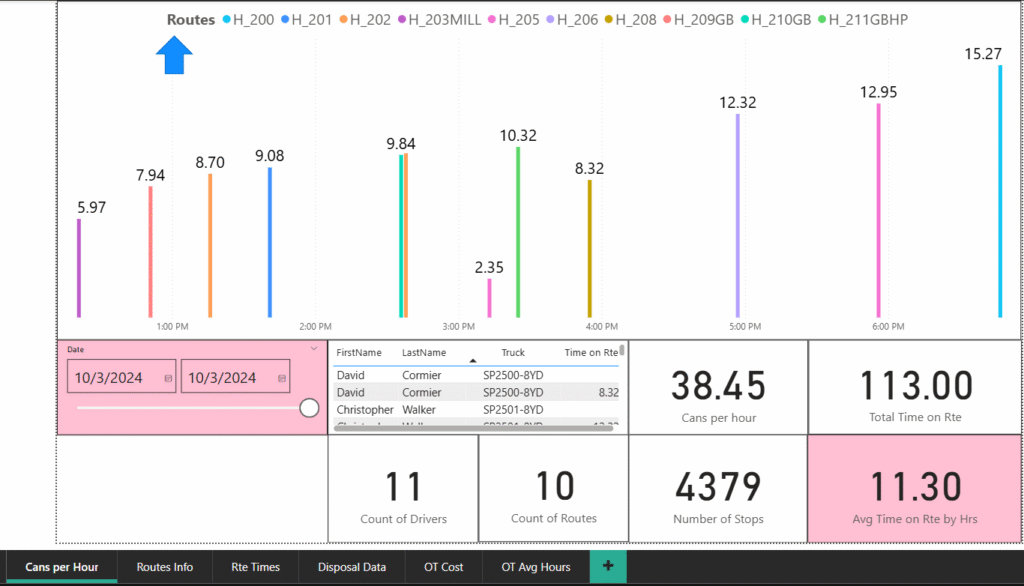
This Power BI dashboard was designed for Stinky Pinky, a residential trash-hauling company, to track and analyze route efficiency on a given service day. The screenshot reflects Thursday, October 3rd, 2024, and gives the Operations Manager a clear breakdown of route performance across key metrics.
At the top, the hourly column chart shows how many trash cans were collected per hour by each active route. Each bar is color-coded by route ID (e.g., H_200, H_203MILL, H_211GBHP), allowing managers to quickly spot performance differences. For instance, Route H_210GB peaked at 15.27 cans/hour around 6 PM, while H_205 dipped to just 2.35 cans/hour at 3 PM—revealing opportunities for rebalancing workloads or identifying bottlenecks.
Beneath the graph, an interactive data table lists driver names, assigned trucks, and individual time spent on route—giving granular visibility into staffing and vehicle usage. The visual filters allow date changes and route-by-route deep dives, making this dashboard a valuable daily tool for optimizing labor, logistics, and customer service.
🛻 Residential Route Overview – “Routes Info” Tab
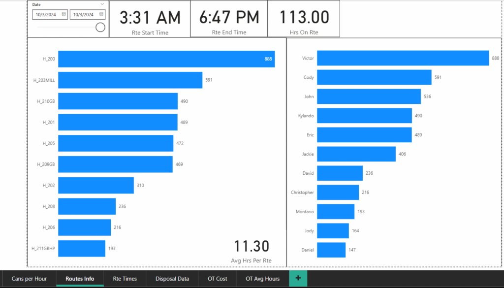
This Power BI dashboard view breaks down individual driver activity and route totals for October 3, 2024, giving operations leadership at Stinky Pinky a fast, data-backed look at productivity by both route and employee.
The left bar chart ranks each route by total number of trash cans serviced, from Route H_200 (888 cans) to H_211GBHP (193 cans). This helps the team evaluate route density, uncover possible overloading, and rebalance if needed.
The right bar chart shows how many cans each driver collected. For example, Victor led with 888 cans, followed by Cody (591) and John (536). Lower collection counts by drivers like Daniel or Jody could signal lighter routes, training gaps, or early clock-outs—all actionable for management.
This tab helped the operations manager answer two crucial daily questions:
- Who started earliest and worked latest?
- Which drivers and routes are over or under capacity?
Combined with other tabs, this visual ensured smarter route planning, labor optimization, and increased route equity across the team.
📈 Route Time Trends – “Rte Times” Tab
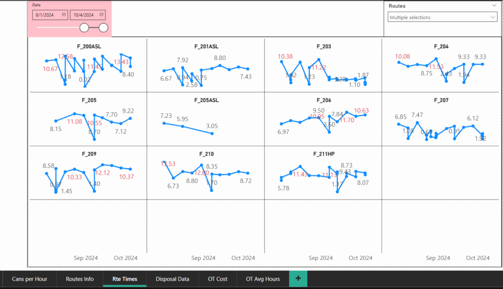
This time-series dashboard provides an 8-week performance view across multiple residential garbage routes. It helps supervisors quickly assess route duration stability, identify outliers, and evaluate operational efficiency over time.
What it shows:
- Each small multiple chart (e.g., F_200ASL, F_210, F_211HP) displays a line graph of daily route duration (in hours) from August 1 to October 4, 2024.
- The x-axis represents time (weekly progression), and the y-axis reflects total hours worked on that route per day.
- Red text values highlight exceptionally long route durations—likely over 10 hours—which may indicate overtime, delays, or heavy loads.
Key Observations:
- Routes F_209, F_211HP, and F_210 consistently show high daily totals, with peaks like 12.12 hrs, 13.94 hrs, and 13.53 hrs flagged for further review.
- F_205ASL and F_207 show lower, more consistent durations, likely indicating more efficient routes or fewer service stops.
- Spikes and dips across all routes help management spot unexpected delays, dispatch errors, or staffing issues.
How it was used:
This dashboard allowed the Ops Manager to:
- Evaluate which routes require load balancing to reduce burnout and avoid overtime.
- Spot trends like frequent overages on the same days, which could link to landfill delays or equipment failures.
- Prioritize field audits on routes with irregular patterns.
Altogether, this visual helped leadership transition from reactive to proactive route planning—reducing costs and improving driver satisfaction.
💸 Overtime Cost Tracking – “OT Cost” Tab
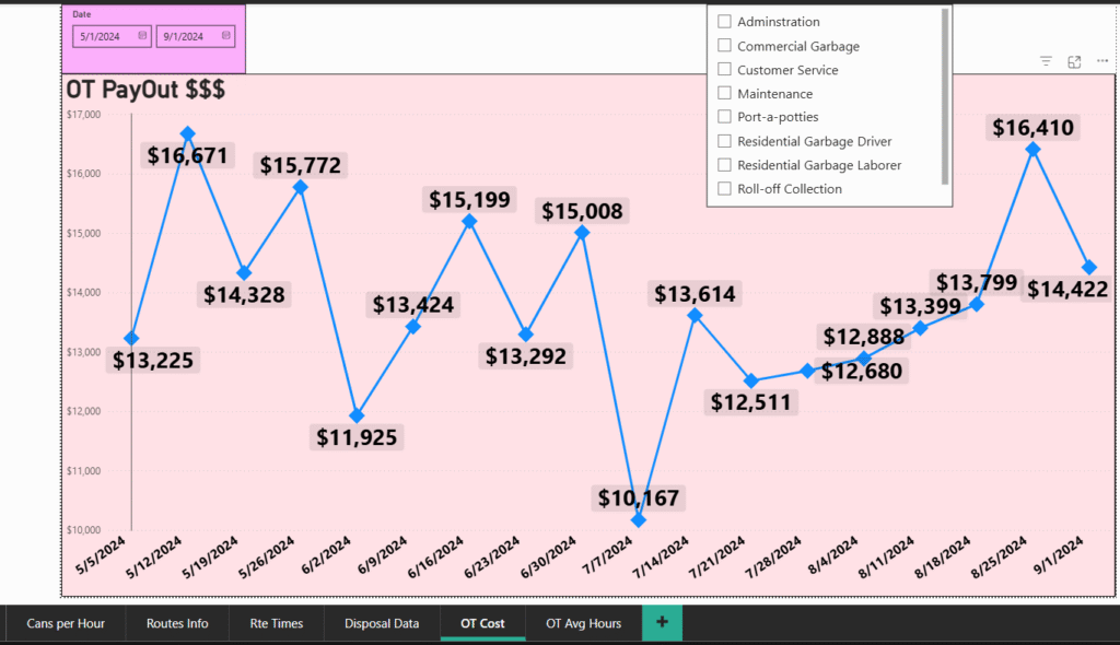
This dynamic overtime (OT) tracking dashboard highlights fluctuations in weekly OT payouts from May 1 to September 1, 2024, providing leadership with clear visibility into rising labor costs.
What it shows:
- Each data point on the line graph represents the total overtime payout for a given week.
- Labels display the exact dollar amount, making it easy to pinpoint high-cost weeks at a glance.
- A slicer lets users filter by department, such as Residential Garbage Drivers or Commercial Garbage, to analyze who’s driving costs.
Key Findings:
- Spikes like $16,671 (5/12) and $16,410 (8/25) signal unsustainable peaks in labor expenses.
- The lowest recorded week at $10,167 (7/7) stands out as a potential benchmark for ideal scheduling.
- Fluctuations suggest underlying issues in route planning, equipment availability, or staffing shortages, all of which were previously untracked.
Why it mattered:
Before this dashboard, overtime was buried in payroll logs and went largely unchecked. This visualization made it possible to:
- Monitor OT trends in real time.
- Identify which departments or routes consistently ran over schedule.
- Start taking action—like load balancing, route optimization, and shift restructuring—to save thousands per month.
Result:
This dashboard gave leadership a strategic lens on a major budget leak—and turned overtime from a passive expense into a controllable variable.
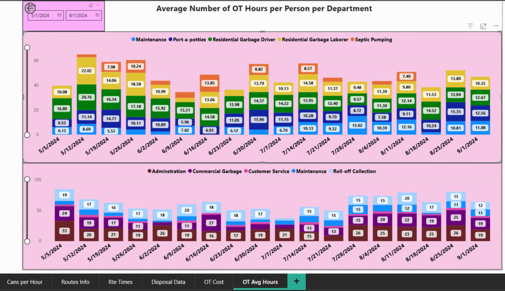
📊 OT Breakdown by Department – “OT Avg Hours” Tab
This dual-panel stacked bar chart shows the average number of overtime hours per person, per department, across a 4-month span. By breaking OT down by team and week, this dashboard offers valuable insight into workload distribution, staffing gaps, and burnout risks.
Top Section: Field Operations
- This panel highlights core frontline departments: Maintenance, Port-a-potties, Residential Garbage Drivers/Laborers, and Septic Pumping.
- Stacked colors reveal how OT hours are split across roles each week.
- For example, on 5/12, Residential Garbage Laborers logged an average of 22.02 hours per person, a major red flag suggesting either understaffing or inefficiency.
- Steady contributions from Residential Drivers and consistent spikes from Septic Pumping help leadership identify which units are most chronically overloaded.
Bottom Section: Admin & Support Teams
- This panel includes Administration, Commercial Garbage, Customer Service, and Roll-off Collection.
- Weekly OT hours here are noticeably steadier, but there are occasional jumps—such as a 26-hour per person average in Roll-off on 6/2 and 8/11, suggesting temporary resource strains or special events.
- Helps differentiate critical field issues from support team fluctuations, which require different solutions.
Why it matters:
- Before this, managers had no way to pinpoint if OT cost spikes were due to a few overburdened employees or a systemic pattern.
- This view uncovered chronic workload imbalance in specific departments and guided decisions like:
- Strategic hiring
- Load redistribution
- Adjusted shift schedules
- Preventative maintenance investments
Result:
By visualizing average OT hours per worker, this dashboard helped turn vague cost concerns into data-backed operational improvements, reducing burnout risk and allowing smarter labor planning.