
Healthcare Claims & Payments Dashboard
This dashboard simulates a real-world healthcare environment built entirely from scratch using a custom schema and realistic, randomly generated data using Python with Pandas and Faker, I created seven interlinked database tables, including Patients, Appointments, Claims, Payments, and Billing Codes. The data spans over a 3-month window and reflects key healthcare operations such as patient visits, insurance claims, reimbursements, and admissions.
In Power BI, I designed a clean and functional dashboard highlighting:
- Claim approval rates
- Average time to payment
- Total billed vs. paid by payer
- Top billing codes by frequency and revenue
- Interactive filters for payer, status, and date range
This project not only demonstrates my technical skills in SQL, Python, and data modeling, but also showcases my ability to visualize complex healthcare operations in a way that supports insight-driven decisions.
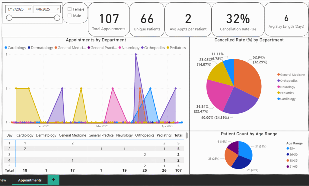
This dashboard is part of a healthcare analytics project I built to explore trends in patient appointments, department workload, and cancellations. The goal was to simulate a real-world clinic setting and deliver fast, clear insights to stakeholders like operations managers and medical staff.
What’s Included:
- Key metrics like total appointments, unique patients, average appointments per patient, and cancellation rate
- Department-level breakdowns and visual trends over time
- Patient demographics with age and gender filters
- Interactive slicers that let you filter by date and gender
How I Built It:
- Created a custom SQL schema in MySQL Workbench
- Generated clean, realistic fake data using Python (Pandas + Faker)
- Modeled and visualized it all in Power BI, keeping performance and clarity in mind
This is the second page of a multi-part dashboard project focused on end-to-end healthcare data. The design is clean, interactive, and ready for real-world use.